

Impact
Context
As our flagship business, NYCNewYears.com sells tickets to thousands of tourists each year for New Year's Eve events in New York City.
With that in mind, we needed to update and overhaul the site:
- Internally we needed to better automate how we build and maintain our events.
- We needed to better serve our online customers with an improved User Experience.
- We needed to build stronger trust with potential customers, especially international tourists spending a lot of money for a once-in-a-lifetime New Year's Eve experience.
What came of this was a completely redesigned site with an overhauled homepage that showed who we are and what we provide, plus better backend tools to improve our event workflows.
The Challenge
Our old website was working, but it had a lot of messy code built up over the years. We wanted to approach this update as a complete overhaul, focusing on reducing code and making things more efficient while improving the site itself. It was built on an old WordPress Genesis child theme with hand-coded HTML scattered throughout widgets and custom fields. This created bottlenecks in our workflow - the team would often need to manually update dozens of event listings with details like venues becoming sold out, or venues being unavailable or closed. Without a better system, human error would happen during our busiest season, exactly when we couldn't afford mistakes.
From a customer perspective, our site was behind modern UX standards. Our research and heatmaps showed visitors struggled to compare different venues and event types. The mobile experience was especially problematic, with important info buried under multiple clicks and elements that didn't work well on phones. This was a big concern since over 83% of our traffic comes from mobile devices.
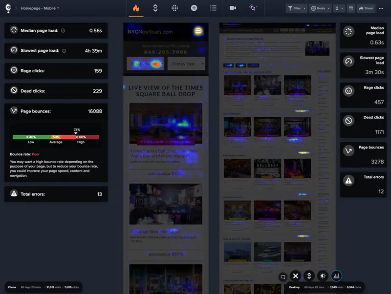
Heatmap showing mobile vs desktop engagement patterns.
The trust issue became clear through customer feedback, especially from mobile users who often asked, "Is this real?" This showed a basic credibility gap in our website. International tourists planning a once-in-a-lifetime New Year's Eve in NYC were being asked to spend a lot of money on tickets through a website that didn't look legitimate enough.
The main cause was found through user testing: we were missing key trust elements throughout the purchase journey. On mobile specifically, an important paragraph that explained our business had been removed during previous sales updates. Without these trust signals, potential customers didn't have confidence in us, especially those coming from overseas who couldn't verify us through local knowledge.
Our analysis found several trust problems:
- Not enough venue verification (customers couldn't easily confirm we had relationships with NYC venues)
- Lack of social proof from previous customers
- Not enough info about our business history
- Missing evidence of previous successful events
- Unclear pricing details
These trust issues directly affected our conversion rates, with heatmaps showing users leaving the site exactly when they should have been buying tickets.
Solution
Discovery & Planning
I started with a complete audit of our existing system, documenting both the technical architecture and user flows. Working with the CEO and COO, we set clear priorities: improving our internal event management workflow, making the mobile experience better, and adding stronger trust signals throughout the purchase journey.
Using insights from our analytics and customer feedback, I created user personas for our main audience groups:
- International tourists planning months ahead
- Domestic visitors making last-minute decisions
- Group organizers coordinating for multiple people
- Luxury experience seekers wanting premium options
- Budget-conscious customers looking for value
Technical Architecture Overhaul
The first big decision was to stick with WordPress because of the SEO strength of our brand that existed for decades. But we decided to completely rebuild the theme architecture. I designed a component-based structure that would separate everything, making the code easier to maintain and reducing overall complexity.
Theme
 ├── Header Component
 ├── Footer Component
 ├── Event Grid Component
 ├── Venue Page Component
 ├── Category Filters Component
 └── Location Navigation Component
For the post editing in the admin, the old system was a bunch of Custom Fields that had to be manually input with custom IDs, html embeds, and links.
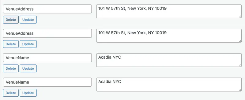
Previous Custom Fields Interface.
Instead, all that was removed and replaced with actual user interface dropdowns and inputs for team members to use more easily without having to remember the custom field IDs.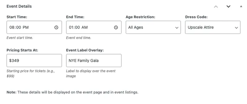
New Admin Event Details Interface.
Our old site used Google Map embeds that worked well, but slowed down page loading. Also, we would still have to input the venue name and address as well as the map embed via Custom Fields. Instead, I built an interface in the admin section that would use Google Places and Google Maps API to show a static map with the Name and address of the venue that links to google maps when clicked. This gives a definite page load boost.
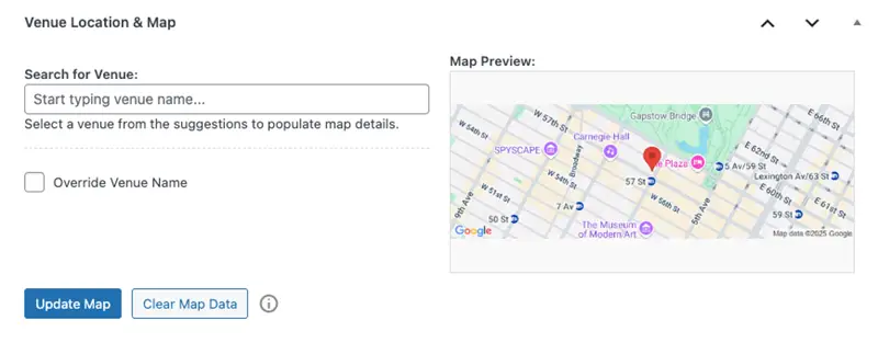
New API-driven Map Admin Interface.
The trickiest part was connecting with multiple ticketing platforms (TicketSauce, Eventbrite, Tixr, etc.) through one interface. I developed a standardized API wrapper that normalized data across these different systems, letting us keep a consistent user experience no matter which ticketing provider we used.
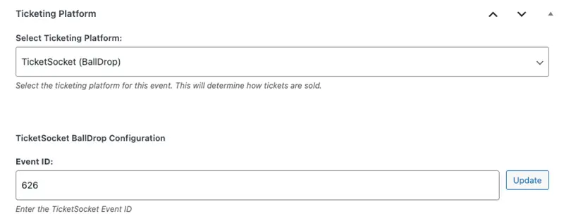
New Unified Ticketing Interface.
A key focus was reducing actual code to make the site more efficient. Through refactoring and component-based architecture, we significantly reduced the theme's file size and complexity. By removing redundant code and creating reusable components, we improved maintainability and enhanced the site's performance and loading times.
One big challenge we fixed was the inefficient structure of our category and status pages. Before, if we had events that were closed, sold out, or unavailable, we needed separate template pages for each category-status combination. This meant about 36 different page templates (twelve categories × 3 status types), creating unnecessary complexity and maintenance headaches.
We completely restructured this system, reducing it to just three template types managed via categories in the WordPress backend. Editors could simply check a category from a checklist in the editing area rather than selecting from dozens of templates. This simplified approach cut down the amount of code, saved a lot of time in content management, and removed many opportunities for human error in our internal workflows.
User Experience Redesign
For the frontend redesign, I started with mobile-first wireframes that prioritized crucial information for decision-making:
- Clear event categories and filtering options
- Prominent date and pricing information
- Venue highlights with visual indicators
Based on our Crazy Egg findings, we decided to completely change the homepage structure, turning it into more of a landing page format. The new homepage has a redesigned hero section with a fun, engaging statement about what we do, immediately showing our value and building credibility. On a design level we took numeric balloon images and dynamically made them represent the new year and animated them to float for some visual flair. These balloons are programmatic - when the new year comes, they automatically change to show next year in balloon form!

Our dyanamic balloon numbers.
Rather than keeping all events on the homepage as we did before, we moved them to a dedicated events page that kept the familiar layout but without the descriptive copy that now appears prominently on the homepage for all device sizes. I also added a location-based navigation system that let users quickly filter events based on NYC neighborhoods, helping both tourists familiar with the city and those who wanted events near their hotels.
Another big challenge was the site's poor search functionality. Before, we only offered limited dropdown menus: "find by name," "find by location," and "find by type" on desktop, while mobile users had just "find by name" and "find by type" options. This created a confusing navigation experience, especially for mobile users who make up our largest audience.
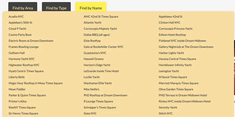
Previous Messy Dropdown on Desktop.
To fix this, we completely reimagined our search approach:
- We turned "find by type" into a prominent category bar that appears on nearly every page, with intuitive categories like "best cruises" or "fun rooftops" that match how users actually think about their event preferences.
Categories component - swipeable on mobile
- For mobile users, we implemented this category system as a carousel-style interface similar to Instagram's navigation bar, creating a familiar and touch-friendly experience.
- We replaced the limited "find by name" dropdown with a full-featured search bar with fuzzy logic, making it much more likely users would find what they're looking for even with partial searches.
- For location-based searches, we added a dedicated location icon in the header of every page (both mobile and desktop), which opens a modal with geographical filtering options when tapped.
These improvements made the site way more intuitive while offering better search capabilities, reducing the steps needed for users to find relevant events.
For the event listing pages, I created a card-based design with consistent information hierarchy:
- Event name and venue prominently displayed
- Price range with clear "starting at" indicators
- Visual badges for special features (ball drop views, open bar, etc.)
- Availability status with urgency indicators when appropriate
- High-quality venue images optimized for all devices
Trust & Social Proof Improvements
To address the "Is this real?" concerns we often got, we added trust-building elements throughout the entire user journey:
Homepage Trust Elements
We added a moving logo carousel featuring our venue partners prominently on the homepage. This immediately showed our legitimate relationships with recognizable NYC establishments that customers could independently verify.

Homepage logos for social proof.
Trust Signals Throughout
Rather than putting social proof in just one section, we placed trust elements at key decision points across the purchase journey:
- In the early exploration phase: Clear "About Us" info, media mentions, and customer testimonials
- During venue consideration: Photo galleries from previous years' events, venue partnership info, and location details
- At purchase decision time: Transparent pricing with breakdowns of what's included, security badges, and info about our concierge service
- After purchase: Clear communication about ticket delivery and event details, plus FAQs addressing concerns about legitimacy
These elements were designed to build trust as users moved through the site, answering the "Is this real?" question before it could even come up.
Testing and Iteration
Before full deployment, I set up A/B testing on critical conversion pathways to validate our design decisions. This allowed us to make data-driven refinements to button placement, form fields, and call-to-action copy that measurably improved conversion rates.
Development Process
My technical approach to building the site followed a lean, iterative process:
- I started by creating a standalone prototype using basic HTML, CSS, and JavaScript – completely separate from WordPress. This lightweight prototype focused on just three key page types: the homepage, events listing page, and a single venue page layout.
- This prototype was hosted on Netlify, allowing the CEO, COO, and team members to quickly interact with the new design concepts and provide feedback before committing to full development.
- Once the prototype was approved, I used VS Code alongside AI tools (Cline and Anthropic Claude 3.7 Sonnet) to rapidly develop the full WordPress implementation. The AI assistance was really helpful for generating boilerplate code, refactoring repetitive patterns, and solving complex integration challenges.
- This approach let me accomplish something I had wanted to do for a long time: dramatically reduce the complexity and redundancy in our codebase. The AI-assisted development helped us rebuild the site with significantly less code while keeping all functionality.
This combo of rapid prototyping, team feedback, and AI-assisted development let us complete the project quickly while achieving much better code quality.
Results
The site redesign launched in May 2025, just as our early-bird sales period began. The technical achievements were immediately apparent, with a significant 48% reduction in code size from 8.2 MB to 4.2 MB.
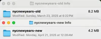
From 8.2 MB to 4.2 MB - a 48% percent in code reduction
This file size reduction not only improved page load times but also simplified future maintenance and updates, making our development workflow more efficient for the long term.
Before

After
The team has been really happy with the new admin interface improvements, with the content editing experience transformed from a complex, error-prone process into a streamlined workflow. What previously required specialized knowledge of custom field IDs and HTML embedding is now accessible through an intuitive interface with dropdowns and visual controls.
Expected Outcomes
As we enter our peak season (October-December 2025), we expect several positive outcomes from this redesign:
- Improved trust signals should reduce "Is this real?" customer service inquiries
- The mobile-optimized experience should lead to higher conversion rates on devices that represent over 83% of our traffic
- Our international customers (over 65% of our audience) will benefit from clearer information architecture
- The unified ticketing platform integration will provide consistent customer experiences regardless of the backend provider
- Content maintenance time will be drastically reduced during our busiest period
Based on the technical improvements and positive internal feedback, we're already planning to expand these interface enhancements and trust-building strategies to our other web properties. The component-based architecture we've developed will make this expansion more efficient, as we can now reuse standardized elements across multiple sites.
Looking ahead, we're planning to add personalized recommendations based on browsing behavior and to improve post-purchase communication with event-specific mobile guides.

