

Impact
Context
As a fast-growing business, Integrate was looking to move away from its humble Material Design beginnings. It had acquired two companies (Akkroo & ListenLoop, where I came from) and needed to unify the different design languages.
The team's goal became over time to work on the foundation behind what would become the design tokens for the Integrate Design System.
The Challenge
No one on the Design Team at the time had any experience ever building a proper Design System from scratch. Some of us had already been familiar with pre-existing systems (Bootstrap, Material Design, & Ant Design), but no one knew exactly how to go about it at first.
There was also a huge adjustment that needed to be handled. This was the joining of three companies through acquisition: an Events Company, A B2B Ad Platform, and the parent - a B2B Lead Gen Marketplace. Each had different design languages & methods that would need to eventually be unified.
Coming from ListenLoop, I was more than just a product designer. I had many hats. I made mockups. I pushed code. I handled some customer sales calls. We used Bootstrap. We used React.js. For myself, this became an adjustment away from generalist responsibilities toward more specific (design) needs of the company.
Integrate was built on Angular.js using version 1 of Material Design. Akkroo was built on PHP and had a mobile app also using version 1 of Material Design. The challenge eventually became not just a design challenge, but an engineering challenge as well.
Solution
Named Hedgehog for it's nimble nature.
To start, the design team came together and did an audit of everything design-related though all our products. We knew that Integrate wanted to move into being a full React application, and we would eventually have to work with front end engineers to build out react components that every engineer in every department could use.
1. Color
My responsibility in this audit started with color. In going through the original Integrate application, we found that they had around 103 colors - 90 colors from Material Design, 8 black variations of text, black & white, and the 3 brand colors. Please keep in mind that the application was originally built from an engineering-first standpoint, before having a design team.
Too many colors to start with that need to be audited.
I took all these colors and ran WCAG background tests to see what would work best as far as accessibility. I also examined the application and saw that even though all these colors were listed, only some of them were actually being used. I suggested to the team that we should reduce the palette by at least 50-60%.
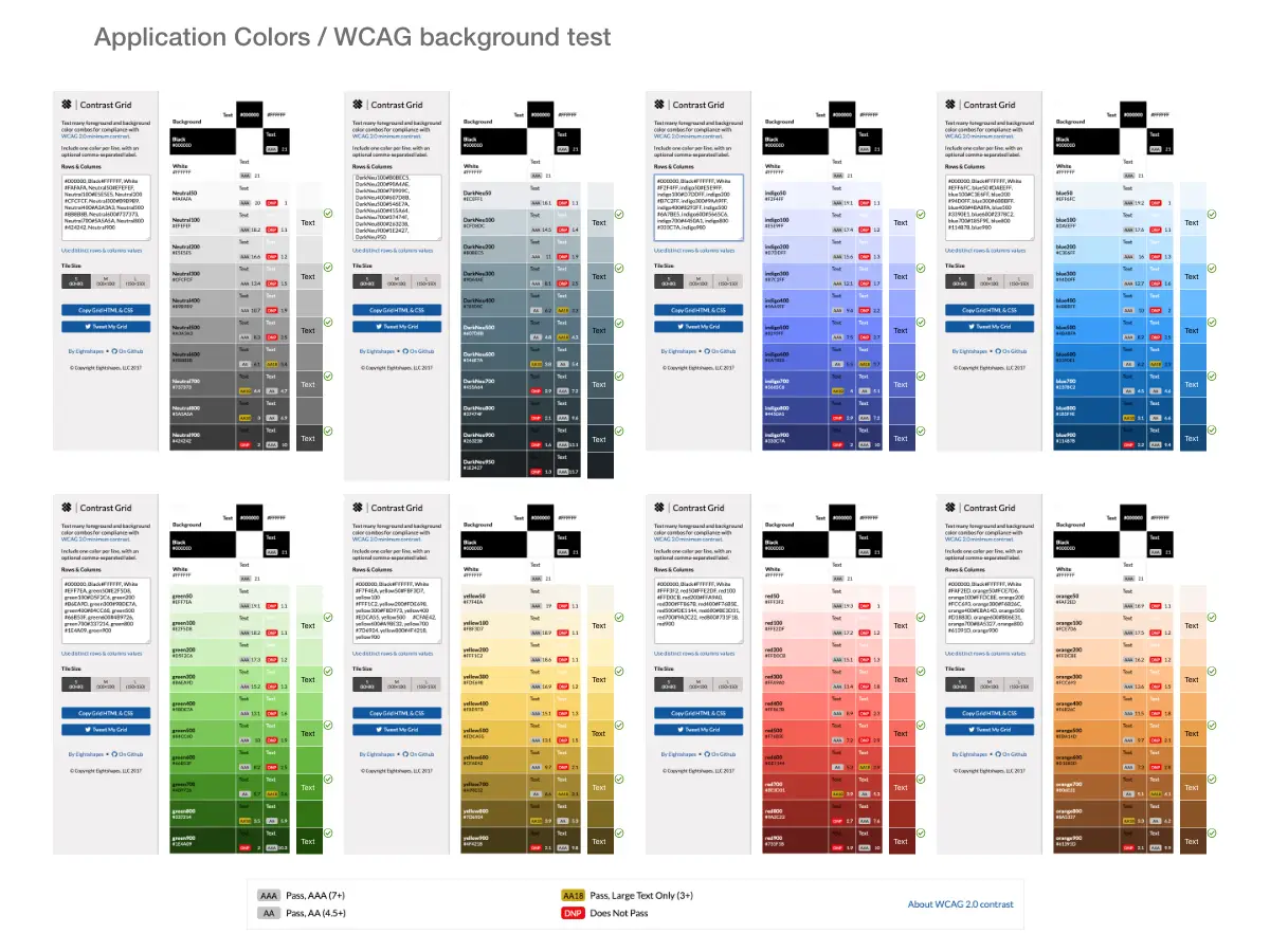
WCAG color audit using Eightshapes' Contrast Grid.
As a designer originally for ListenLoop, I had made sure that the colors proposed worked with our palette. Also, working with the designer at Akkroo, I made sure that their colors were taken into consideration. After some discussion, the team determined that we could reduce the number of colors used down to 46 colors in total, surpassing the 50% suggested. I was certain we could refine this number even more, but for 5 designers working together this was a great start.
The final color choices are in.
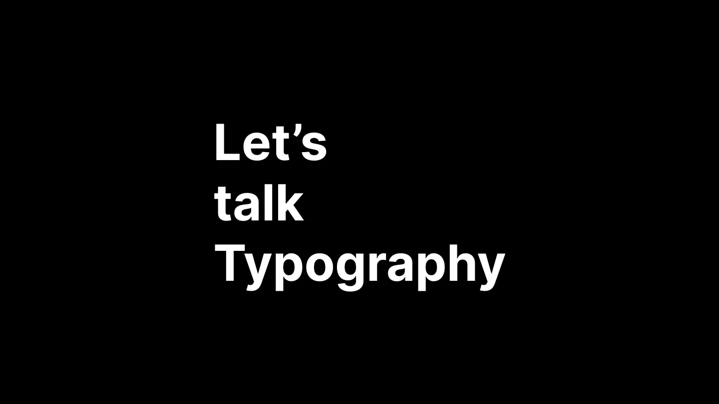
2. Typography
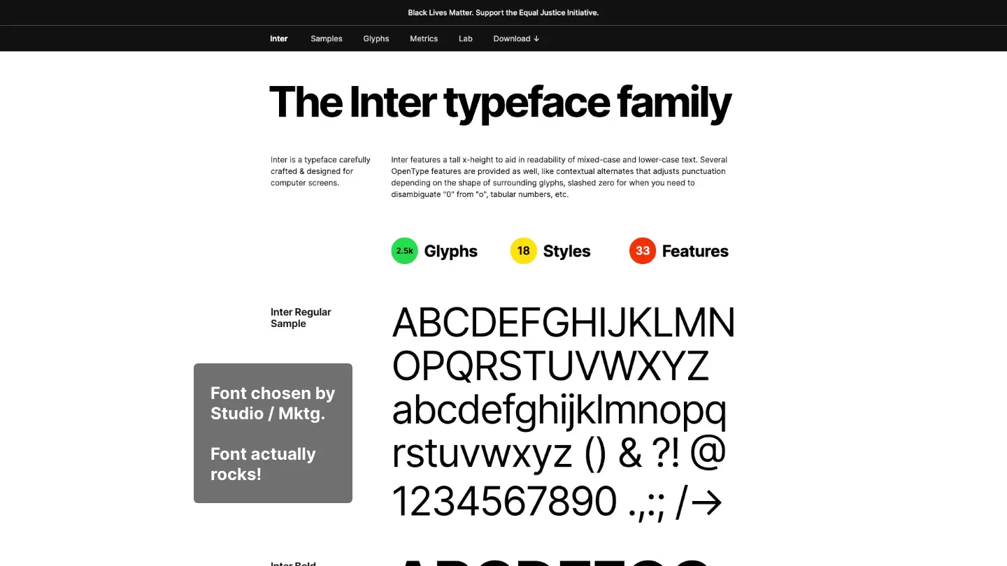
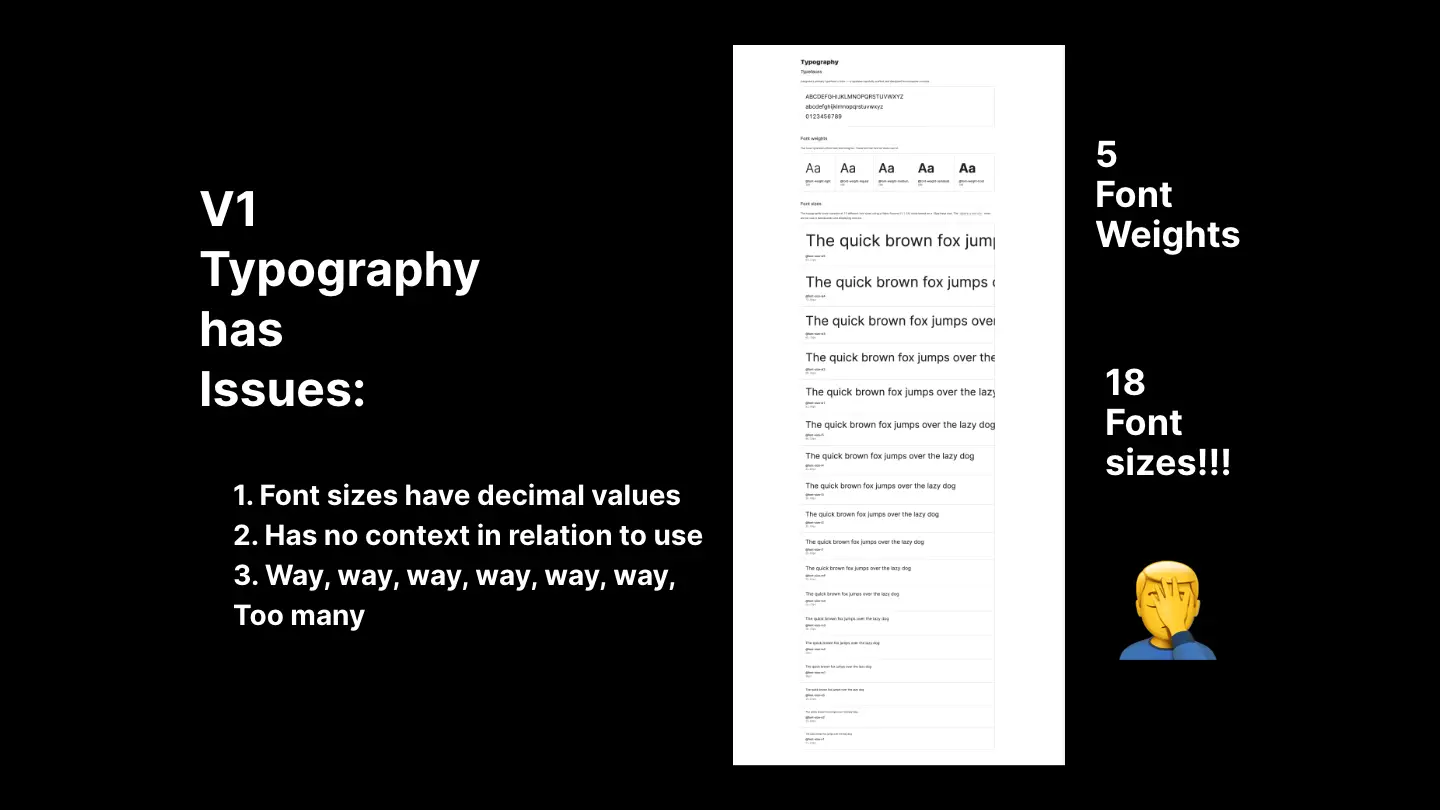
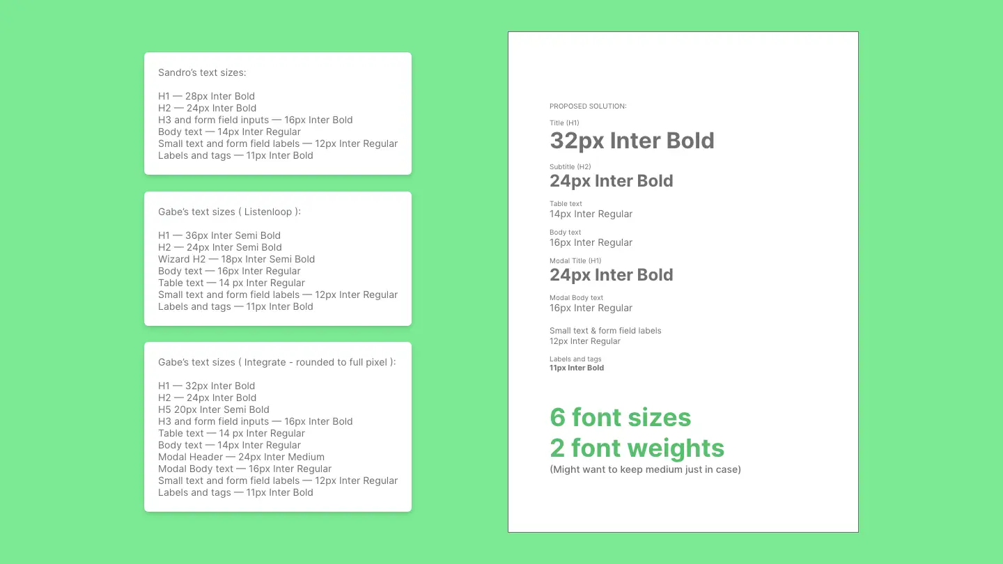
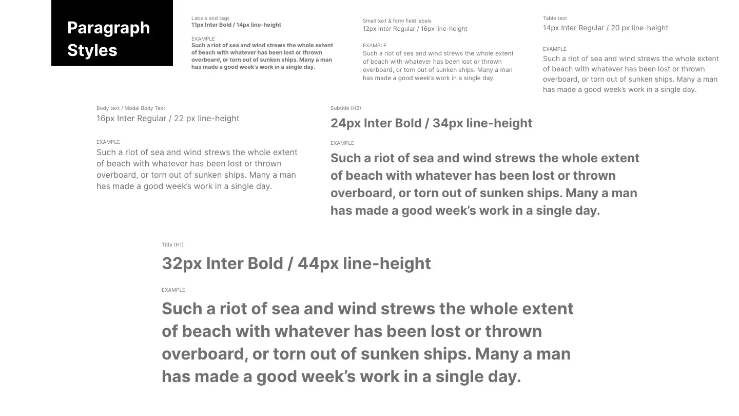
My next responsibility in the audit involved typography. In this, the marketing team at Integrate had already made the decision to use the Inter font through all our web products. We accepted this, but we discovered that the Integrate product was using decimal values in their font sizes and had many weights and sizes, most of which were unused.
Presentation of proposed typography audit.
Looking at all three products' different font requirements, we were able to determine that we could use whole number values for font sizes. We also could reduce the number of font sizes and weights overall by about one-third without any major visual difference in all three products.
3. Text Fields
Now that color and typography was decided, the design team started working on designing different components. I was directly responsible for auditing and unifying the textfield and all its different states.
For this project, I was allowed to look outside of our org for inspiration to work up the best possible text field for the unified product. We knew immediately that Bootstrap’s forms were somewhat rudimentary in comparison to the Material Design fields the Integrate Marketplace application was already using.
Adobe XD doc showing research & results.
For initial inspiration, I looked into how Facebook & Google handled text fields. I even built them out in HTML to see the exact interaction points involved, which helped in formulating a better understanding of creating a field that was going to be utilized a lot with accessibility in mind.
Text Field HTML Research
HTML interactions from both Facebook & Google.
In the end, we went with a simple yet elegant text field that would not use any animation like Facebook and Material Design, but would use color to show states of the text field. We wanted to give a wide berth as well to handle any edge cases that may come up in the future.
Text Field HTML Mockup
HTML mockups for you to interact with.
I also designed the search field with the feature of being able to clear out the field when necessary.
Search Bar HTML Mockup
It's HTML - feel free to type in a search.
4. Badges
Next item I worked on was badges. We noticed that in V1 of the software there were icons being used to signify certain states. These icons were plenty and were hard for a customer to easily understand. Inspired by the badges in Bootstrap, we came up with a grouping of badges based on color that would match the icon colors.
Icons vs Badges - the contest of simplicity.
This was so when introduced to a user who already uses the product, they would already have an easy association to the content. This was tested internally by our customer success team being that they too were going to see this in action. The results were highly successful internally.
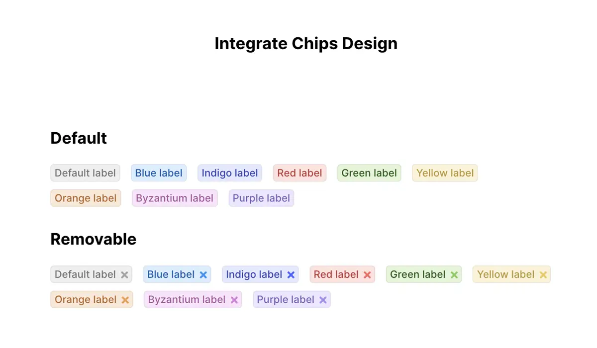
Badges designed simple.
Results
Lessons learned from this endeavor was quite a lot:
- Getting a Design System is not just a design project. Engineering needs to be a distinct part of this enterprise and have to be all-in when it comes to the process.
- There needs to be somewhere where the design and engineering team in charge of this system can find all the information it needs to make sure everything from design documentation to using components exists. For us, we created a cloud document in Figma for all designs and Storybook for the UI component library. We also used Jira to manage the entire project.
- Learning to work with a team was an important experience. In this acquisition experience everyone in the design team had to adjust to not only new members, but the culture that came with them. It was an immersive learning experience for all to be sure.
- A Design System is no easy feat, with constant changes and reiteration needing to be done. This unified language created by this audit was healthy as a valid starting point for a unified vision that energized everyone throughout all parts of the org.

