

Impact
My Role
I was the only Product Designer working on our ABM (Account Based Marketing) products at Integrate. For this project, I partnered directly with our Department Vice President (the former CEO of ListenLoop, which Integrate had acquired) to design and prototype a completely new web analytics dashboard that would give our customers visibility into account-level engagement data.
Context
Integrate's ABM platform had been using a tracking pixel for years to power features like funnel tracking, ad retargeting, and web personalization. This pixel was already installed on hundreds of our customers' websites, quietly collecting visitor data in the background.
The VP came to me with an interesting idea: what if we could use this existing pixel infrastructure to show customers something completely new? Instead of just powering our other features, we could surface the web analytics data itself and show marketers exactly which companies were visiting their site, what pages they viewed, and how long they spent engaging with content.
The goal was straightforward - create a web analytics dashboard that tied directly into our customers' ABM campaigns, giving them account-level insights that traditional analytics platforms like Google Analytics couldn't provide.
The Challenge
This wasn't just an idea we came up with internally. Our major customers - companies like Microsoft and Cloudflare - had been asking for exactly this kind of visibility. They wanted to know which companies were visiting their website and how engaged those accounts were, but Google Analytics couldn't tell them that. It showed individual user behavior, not account-level patterns.
The tricky part was figuring out what "success" even looked like for a B2B web analytics product. After talking with customers and reviewing how they were already trying to track engagement, I identified the key metrics they cared about:
- Time on site per account (not per visitor)
- Intent signals that showed companies researching solutions (we'd later integrate Bombora for this)
- Pages visited to understand what content resonated with each account
The biggest design challenge I faced was completely rethinking how web analytics worked. Everything about Google Analytics is built for understanding individual users - unique visitors, session duration, user paths. But B2B marketers don't care about individual anonymous visitors. They care about companies.
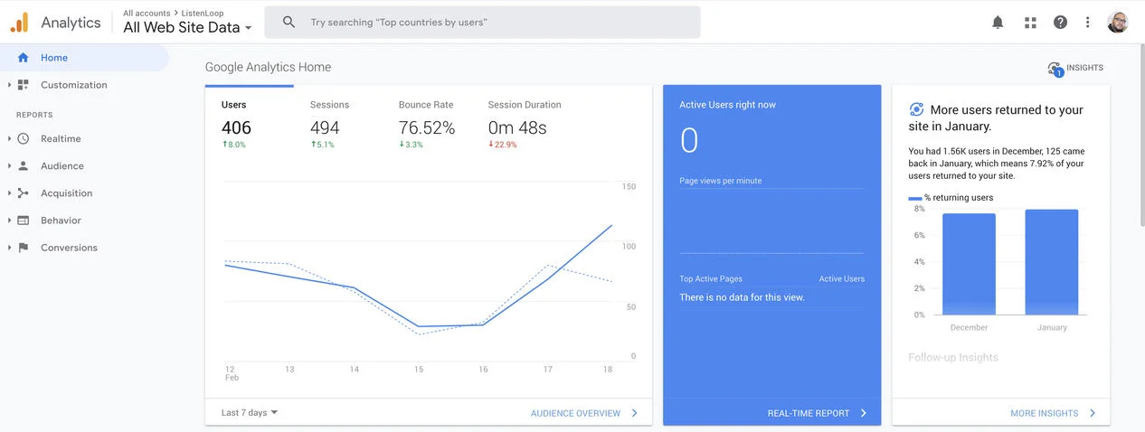
ListenLoop's own Google Analytics at the time. Users, sessions, bounce rate - and not one company name in sight.
I needed to design an interface that could:
- Group anonymous web traffic by company instead of by individual visitor
- Connect visitor behavior to firmographic data (company name, industry, size)
- Show which specific companies were engaging, not just aggregate traffic numbers
This meant I couldn't just copy Google Analytics patterns. I had to adapt familiar analytics concepts to an entirely different mental model.
Early Sketches & Ideation
Working directly with the VP, we started with rough sketches to map out the data architecture and dashboard structure. These early wireframes helped us think through how to organize account data, what metrics to prioritize, and how to structure the information hierarchy.
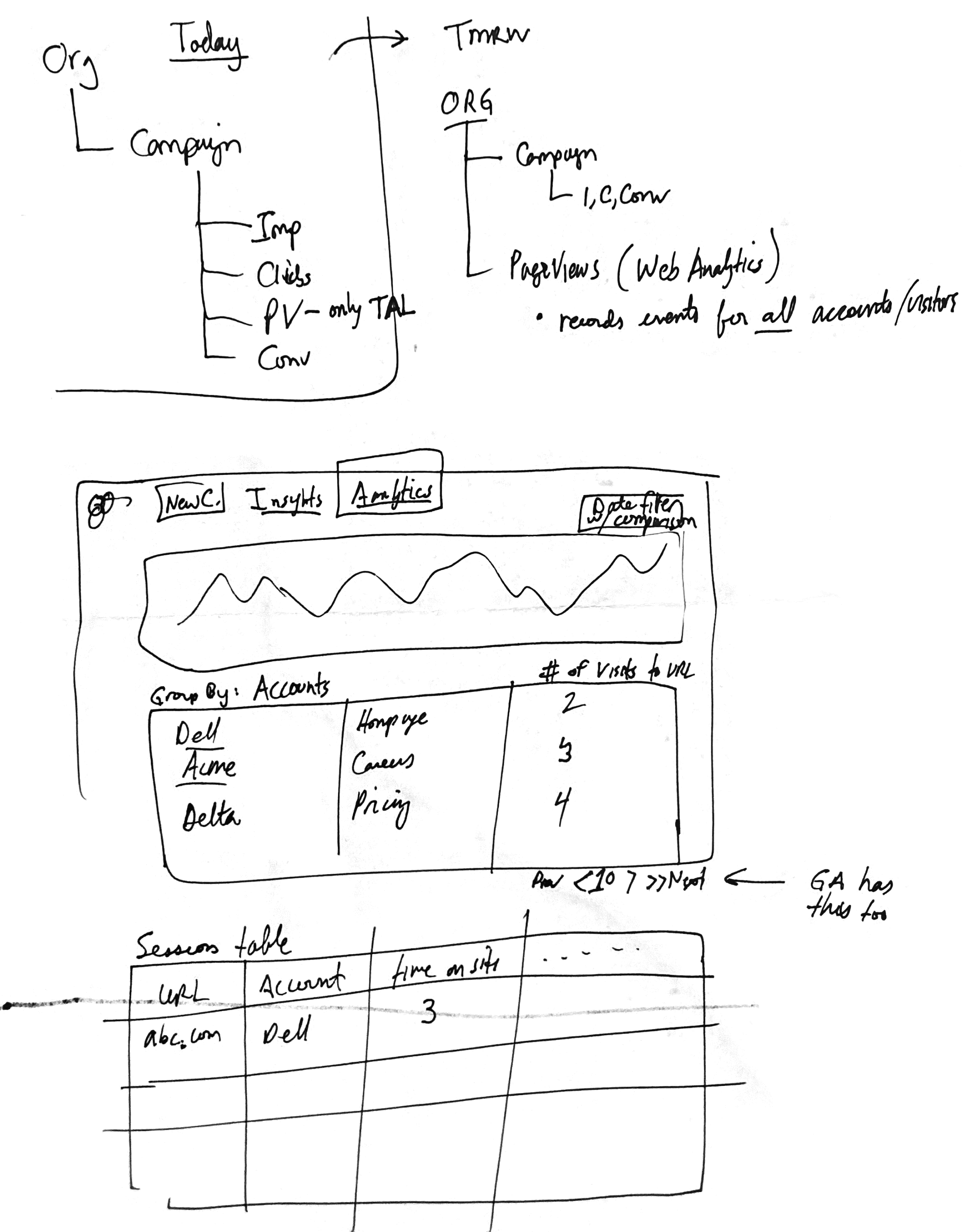
Early sketches showing data architecture (Org → Campaign → PageViews) and dashboard layout concepts with the VP.
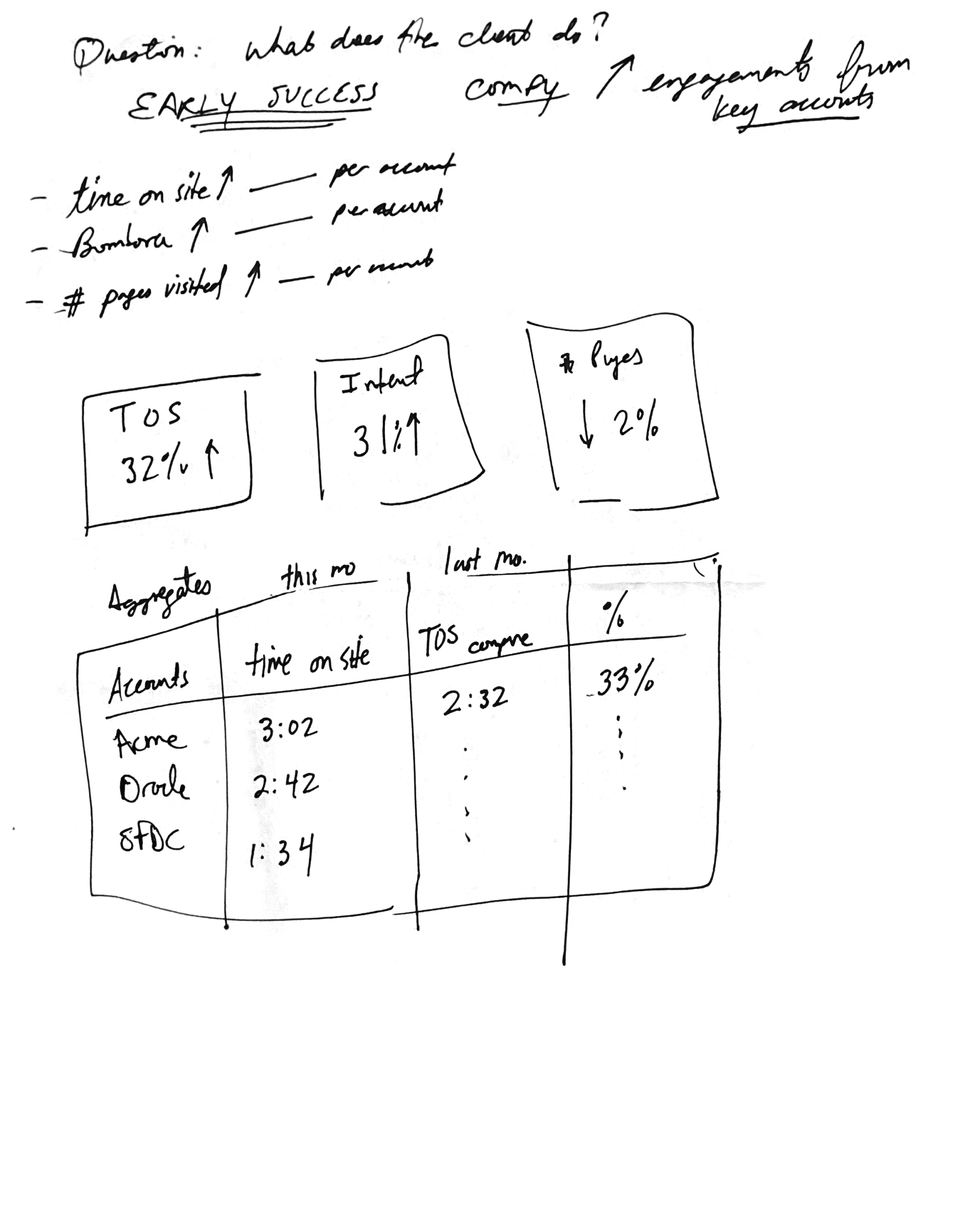
Sketch exploring how to show account engagement metrics and session tables.
Solution
I started by mapping out what data we already had access to through the tracking pixel, then worked backwards to figure out how to present it in a way that would make sense to B2B marketers. The key insight was that we needed to feel familiar (like Google Analytics) while showing completely different data (account-level instead of user-level).
Core Dashboard
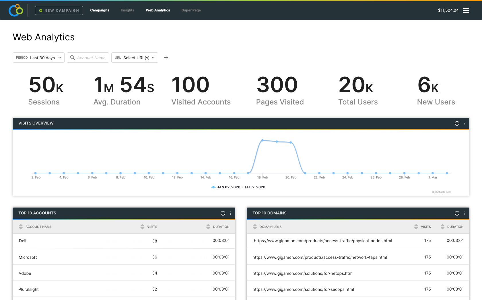
For the main dashboard, I designed a high-level metrics view that immediately showed the scope of web activity across all tracked accounts. The layout borrowed patterns from Google Analytics that marketers already understood - session counts, average duration, total users - but adapted them to show account-level engagement.
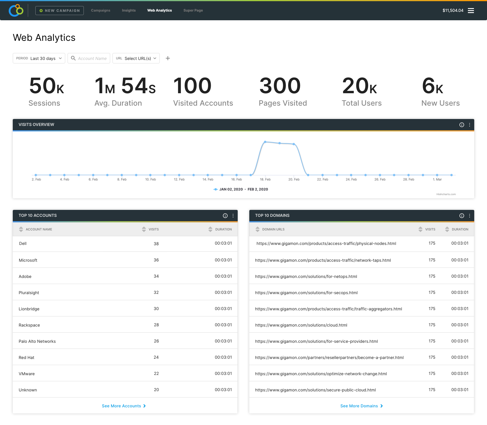
Main analytics dashboard design showing high-level metrics and visits overview chart.
Date Range & Comparison
One feature request that came up early was the ability to compare different time periods. Marketers wanted to see if their content marketing efforts were actually increasing engagement over time. For this, I incorporated a date picker component that another designer on the Integrate design team had created for the design system. Using this component served a dual purpose - it was exactly what we needed for the product, but it also gave us a chance to refine the component in a real-world context and contribute back to the design system effort. This was part of the broader work to unify all the products Integrate had acquired (ListenLoop, Akkroo, and the main platform), and the ABM team was able to provide feedback that helped make this date picker component available for the entire org moving forward.
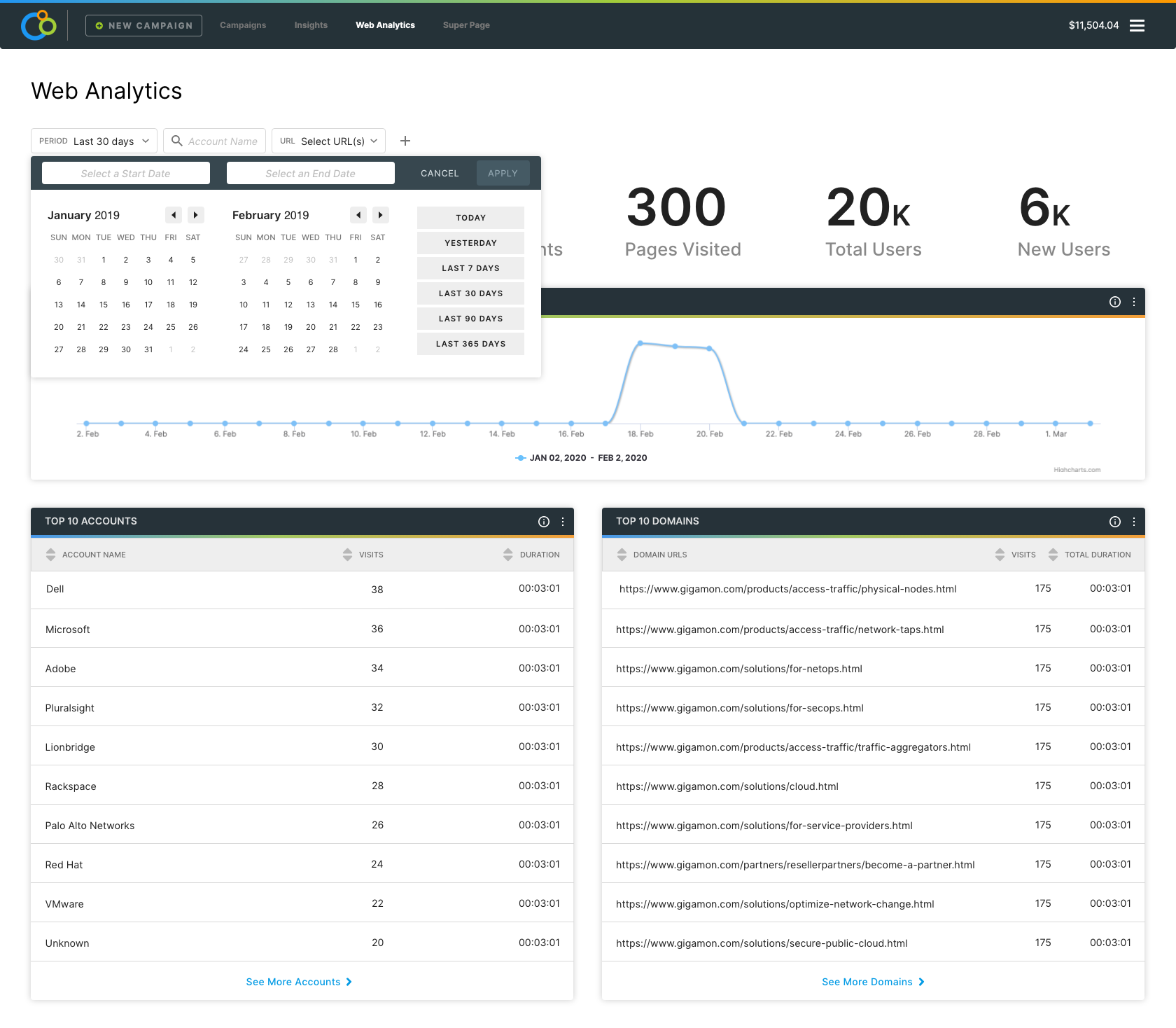
Flexible date filtering allowing users to analyze specific time periods and compare performance.
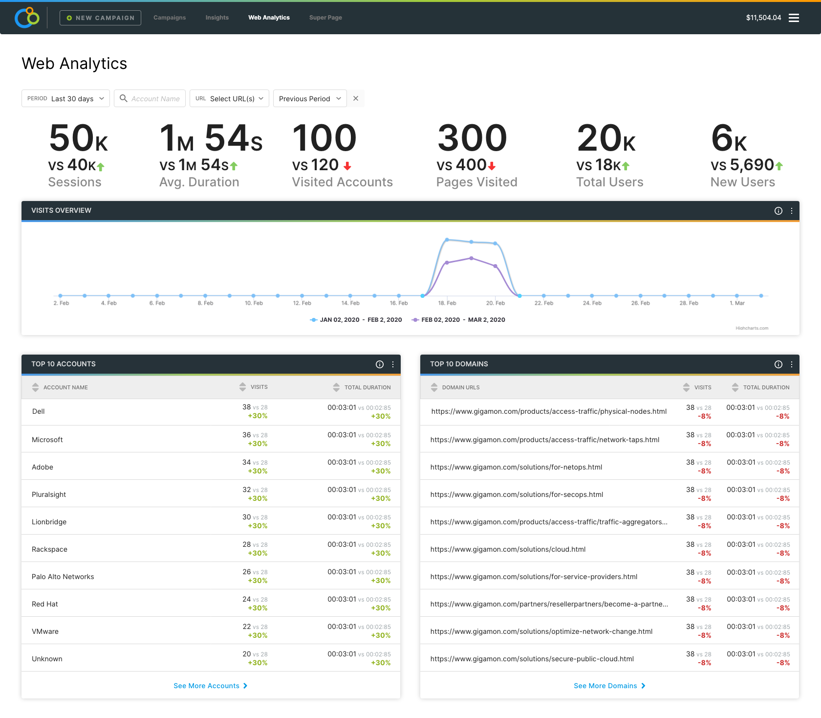
Side-by-side comparison functionality to measure period-over-period changes in engagement metrics.
Account-Level Analytics
This was the core value proposition - showing which specific companies were visiting the site. I designed sortable tables that listed accounts ranked by pageviews, time on site, and other engagement metrics. Each account row showed the company name, number of visits, average duration, and whether they were part of any active ABM campaigns (indicated by a tag icon).
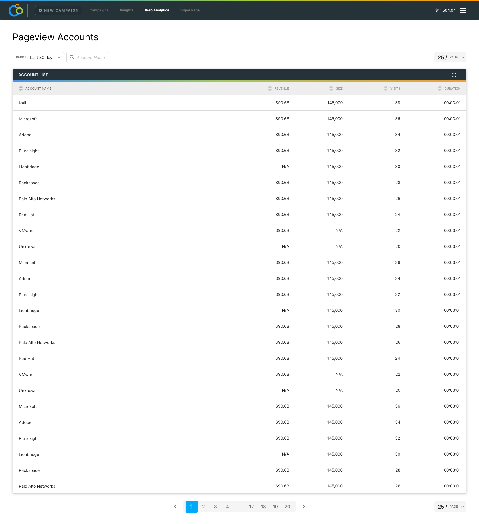
Account-level engagement table design showing company names, visit counts, duration, and account list indicators.
I also designed a companion view that showed the most visited pages and domains. This helped marketers understand what content was resonating - if high-value accounts were spending time on pricing pages or case studies, that was a strong buying signal.
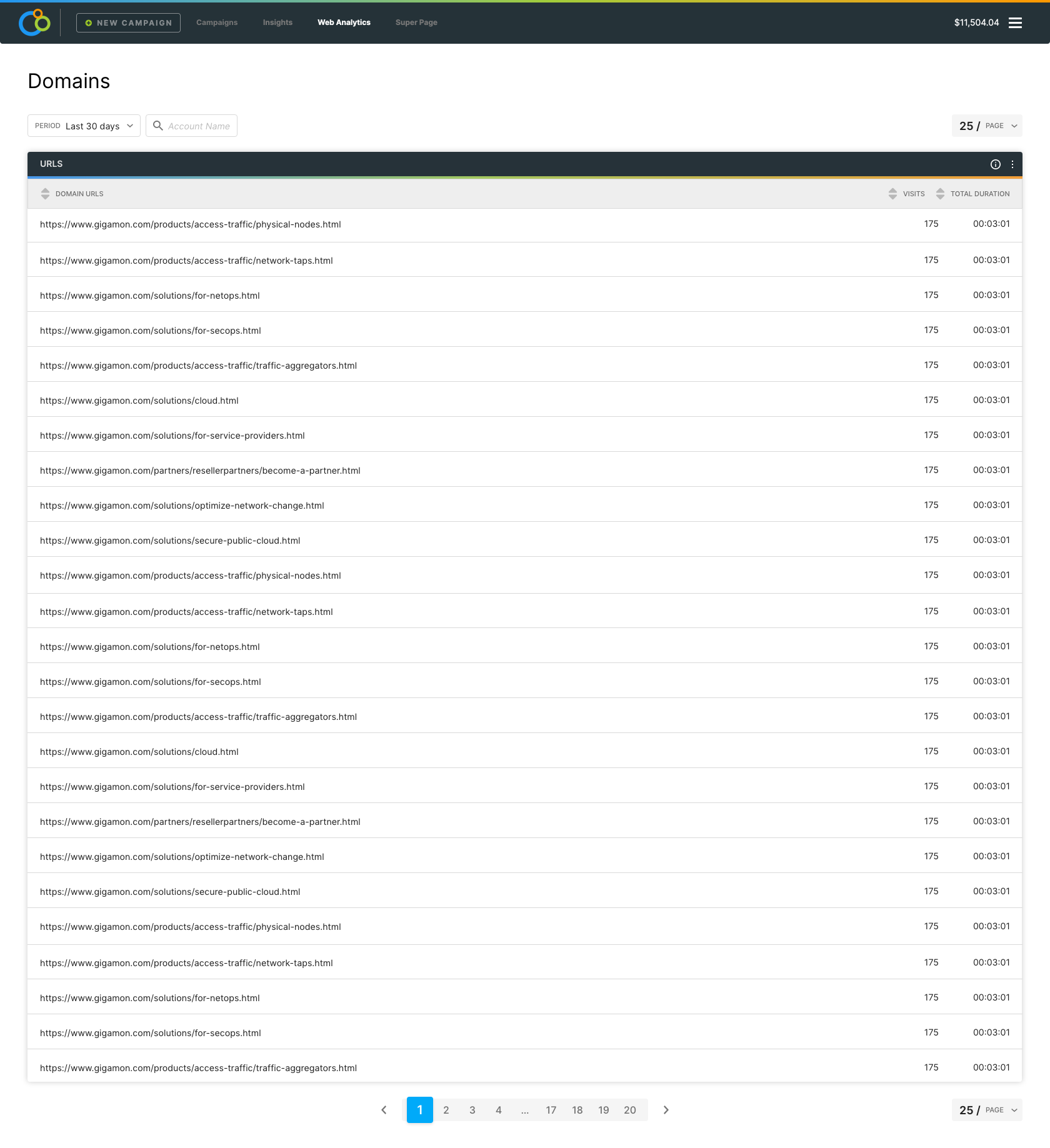
Most visited domains/pages with visit counts and duration metrics, linking web behavior to specific content.
Alerts & Reporting
The last major feature I designed was an alerting system. Marketers didn't want to check the dashboard constantly - they wanted to be notified when high-value accounts showed increased engagement. I created a modal interface where users could set up custom alerts based on account behavior thresholds (like "notify me when an enterprise account visits 3+ times in a week").
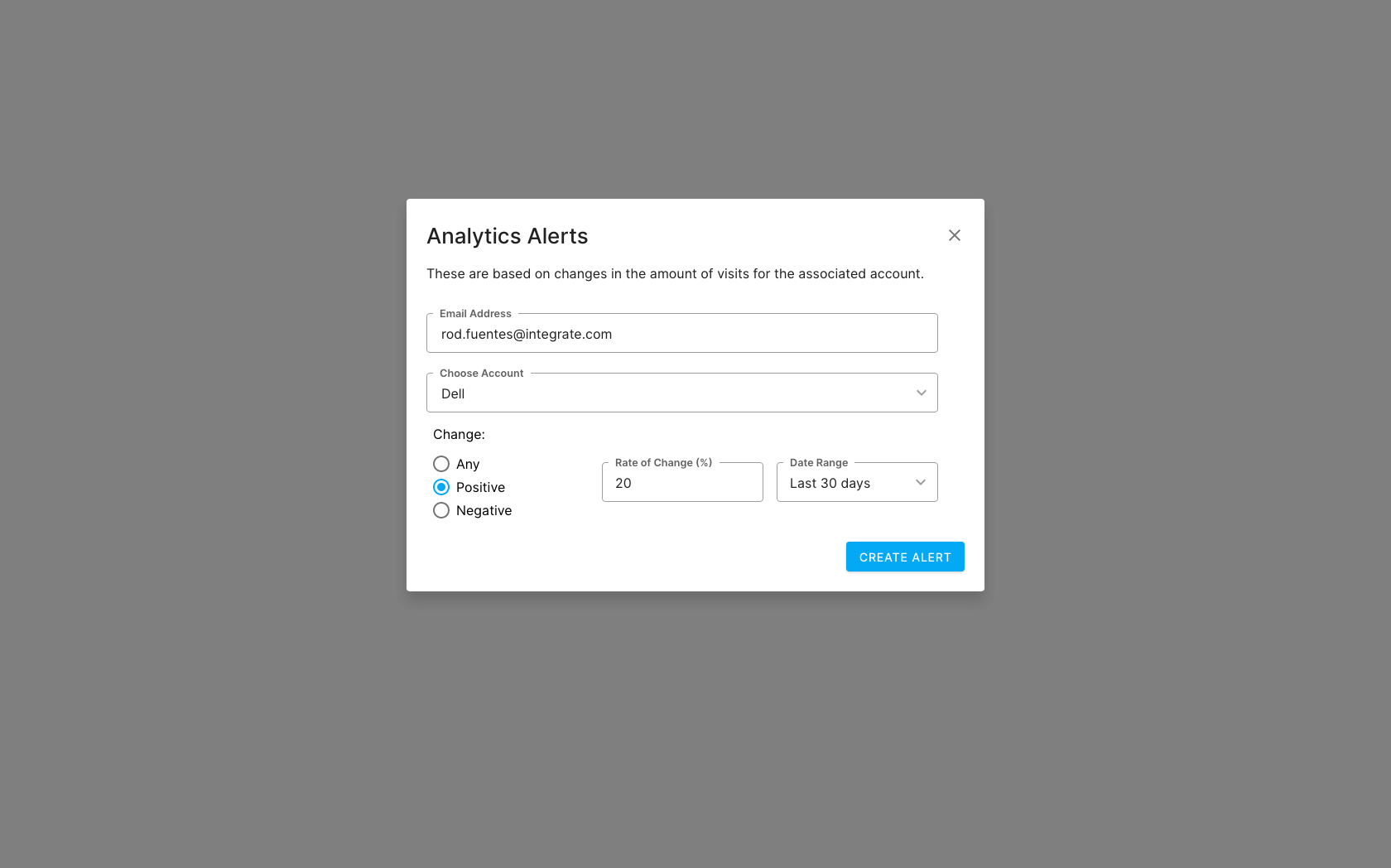
Modal interface for creating custom alerts based on account behavior and engagement thresholds.
The alerts dashboard showed all active alerts and their triggered history, making it easy to manage and adjust thresholds over time.
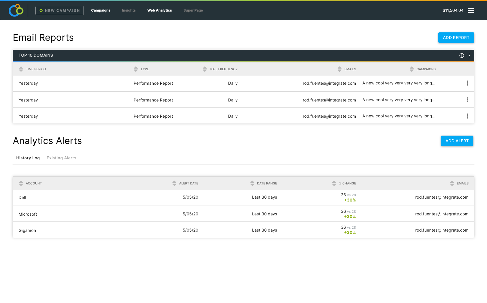
Alert creation interface allowing users to set up automated notifications for account activity.
When alerts triggered, users would see in-app toast notifications that they could click through to see the full account details. This kept them informed without being overwhelming.
In-app notification system keeping users informed of important account activities.
Results & Impact
The Web Analytics product launched in June 2020 and immediately became a differentiator for Integrate's ABM platform. We were offering something that Google Analytics fundamentally couldn't - the ability to see which companies were visiting your website and how engaged they were at an account level.
Business Impact
One of the most exciting outcomes was that this project led directly to a partnership with Bombora, a leading intent data provider. The VP saw an opportunity to layer Bombora's intent signals on top of our web analytics data, creating an even more powerful account intelligence tool. This became a lucrative upsell opportunity - customers could see not just which accounts were visiting their site, but also what topics those accounts were researching across the web.
The product contributed to Integrate's 5% customer growth target by giving sales something concrete to pitch. It filled a gap that customers didn't even realize existed until we showed them - they had ABM campaign metrics and web personalization, but they didn't have a way to see the full picture of account engagement on their website.
Product Integration
Because we built on the existing tracking pixel infrastructure, the Web Analytics product plugged straight into our Web Personalization and Ad Retargeting tools. A marketer could see that a high-value account visited their pricing page multiple times, then immediately create a personalized experience for that account's visitors or set up retargeting ads - all from the same platform.
A note on where things stand today: Integrate has since refocused on lead management and data governance, and most of the ABM product line is no longer active. The screens in this study are my design work from the time.
What I Learned
The biggest lesson from this project was about building on what's already there. Instead of asking engineering to build an entirely new tracking system, I designed the product around the pixel we already had deployed on hundreds of customer websites. This smart reuse meant we could ship faster and provide immediate value with data we were already collecting.
I also learned a lot about balancing familiarity with innovation. Users expected certain analytics patterns because they were used to Google Analytics, but I couldn't just copy Google's interface. I had to keep the familiar parts (date ranges, trend charts, sortable tables) while completely rethinking what the data actually showed (companies instead of individuals).
Working directly with the VP on this project taught me to think about product design at the business level. It wasn't just about making a nice-looking dashboard - it was about creating something that strengthened the entire ABM platform and opened up new business opportunities like the Bombora partnership.

